Call to action
Have you tried Dime cake? It’s so good – check it out. This has nothing to do with the post.
What do you thinK it means?
This post is about k-means clustering. I’ll describe what it isn’t, what it is, and I’ll give some examples of the process. Don’t worry – it’s actually pretty simple.
Broadly – K-means clustering is just the following steps;
- Choose a certain number of groups (we refer to this number as K, hence K-means)
- Randomly group our data into that number of groups
- Measure how badly we did (as in – how different the different points in our groups are)
- Repeat hundreds or millions of times
- Choose the attempt that was the least bad.
If that’s all you really needed – crack on to that Dime cake, otherwise – I’ll go into more detail below.
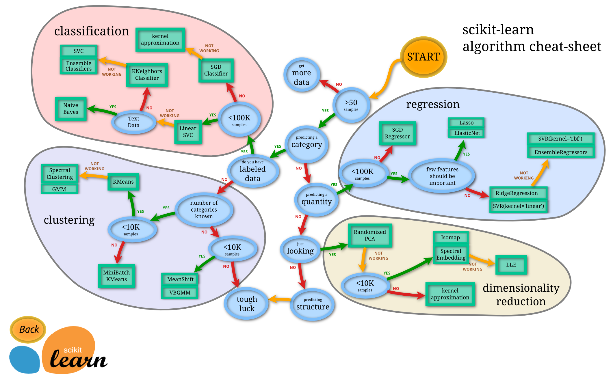
When should I use K-means clustering?
Scikit-learn put together this fantastic diagram to help people choose which kind of algorithm to use for different problems. If you’ve come here because you’re trying to solve a problem, this might help you work out what tool to use. Broadly, if you’re using K-Means clustering you’ll need
- Quite a lot of data
- That you want to be categorised
- You know how many groups you want
- You don’t care if the groups you create are of wildly different sizes (like, one has 1,000 data points and another has 100).
In terms of that last point- I’m in the process of writing another blog post sharing an alternative approach which still uses the K-means clustering process but where you can define group size.
What is K-means clustering good for?
K-means clustering is a way of grouping lots things that might not clearly fit into groups.
By using it you can speed up how quickly you sort your data so that you can make decisions about a few large groups, rather than having to make decisions about, say, 2 million different individual things.
Some examples
Bee hives
You could be a biological researcher trying to work out why bee hives are collapsing. Perhaps you have information about a bunch of different hives including;
- Temperature near the hives
- Air quality readings
- Elevation
- Ambient noise levels
- Size of bee
- Distance from nearest house.
Maybe you think that if you group the hives together you’ll see that certain groups are much more likely to lead to a collapse. If that’s right you could pay particular attention to beehives which are most at risk of collapse, or try to change things to see if it can prevent collapses.
Email segmentation
As another example, you could be a clothing marketer who needs to segment their email list. You have a list of people who differ in all kinds of ways;
- Age
- Gender
- Lifetime spend
- Spend per month
You also know;
- Brands they have bought from you in the past
- Who loves your footwear
- Who love your green clothing
- Who likes your jackets
- Etc etc.
You might use K-means clustering to segment your email list into groups so you have an idea of what kind of content they would like to get in future.
Keyword clustering
To look at something a SEO-centric example; imagine we have a whole bunch of keywords and we want to group them into topics. We could;
- Take each keyword
- Get the top ten pages ranking for that keyword in Google
- Group all of our keywords together based on how similar those top ten pages are.
It stands to reason that if the same pages are all ranking for a bunch of different keywords, those keywords are all similar enough that you can target them with the same content. That could turn a huge mess of keywords into a list of topics and pages to create – much more useful. The fact that K-means clustering doesn’t require the rankings to be exactly the same in order to group keywords can take a lot of the manual work out.
What K-means clustering is not
K-means clustering is not a way to get a machine to do your thinking for you and it’s not a replacement for thinking about your audience.
If you are a clothing marketer and you know some of your audience only ever want to buy shoes from you, even if they particularly like the colour green, no amount of K-means clustering should tell you to send them emails about green jackets rather than shoes. If you decide that, based on your knowledge of your audience, a product is relevant to them, fine, but these groupings don’t tell you the future and won’t allow you to read minds.
K-means clustering is also probably not machine learning in the way you’re thinking about it. The machine isn’t learning anything. Confusingly, it comes under the technical definition of machine learning but if someone is using K-means clustering that doesn’t mean that the machine is automatically calculating answers, that it really understands the problem, or that it’s taking any information from this and applying it to something else. As you’ll see below, this process ends up being a kind of large-scale addition and subtraction.
Using something like K-means clustering also doesn’t mean that the answer is definitely more accurate than other types of analysis. It’s just one way of quickly slicing data.
How does K-means clustering work?
We’re going to use a simple example of grouping sandwiches based on length and height. We’ll go through the full process below. I’m also sharing two things;
The Google Sheet which does all the calculations we discuss below.
I created this sheet to prove that it can be done in Google Sheets but the formulas are kinda messy so picking them apart probably isn’t going to help you understand much more than just reading this blog post. If you’re a Google Sheets geek like me though – feel free to have a play.
A Google Colab Python notebook which goes through the same process
This notebook produces a similar result to what we got in sheets. It’s for those of you who want to play around in Python, or who want to take the code and rework it to use in a project of your own.
K-means clustering in Google Shhets
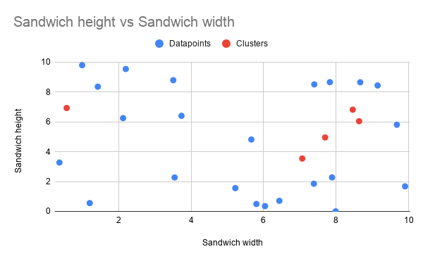
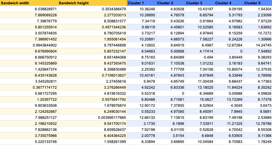
First we start with our data
The first thing we need to do is put all of our data together in the same format so below I’ve created a random list of possible sandwich lengths and heights, and a graph showing them scattered about – that visualisation is going to come in handy as we start to group them.


Then we just randomly choose a bunch of points
Yea – randomly. In some cases we can try to choose starting points that are better suit our data, to speed things up but, in its most basic form, there’s nothing smart about this. We could just close our eyes, spin around, jab our finger on the graph and put the dot where we land. In this case, I’m using the =rand() formula in sheets to choose random points.
As I mentioned before – this whole process is about grouping our data. The number of groups we end up with should be the same as the number of random points we choose now. This number – the number of random points and the number of groups we should end up with, is referred to as “K”. That’s where the “K” in “K-means clustering” comes from.
Here’s a bunch of random points to group around. In this process, we refer to those random points as centroids.
| Width (cm) | Height (cm) | |
| Cluster 1 | 0.5676182173 | 6.928570367 |
| Cluster 2 | 7.697682406 | 4.954093433 |
| Cluster 3 | 8.459766009 | 6.815764284 |
| Cluster 4 | 8.634835468 | 6.043742096 |
| Cluster 5 | 7.066755622 | 3.541373917 |
If we plot our random points (centroids) on our graph they end up looking something like this.
Then we cluster our points together based on the centroid they are closest to
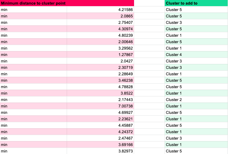
Again, this is probably simpler than people have made it out to be. We look at each of our datapoints, one by one, and then find the random cluster point which is closest to it.
I’ve done that in GSheets as well. The rough process is;
- List out all of the data points
- For each data point, work out how far it is from each of our random centroids
- Work out which distance is shortest
- Choose that cluster.
So all we do is look at each dimension of our data, one by one, and find the difference between the data point value and the centroid value.
In our example we’re working with two dimensions; sandwich widths and heights. Imagine we have a sandwich that’s 15cm wide and 10cm deep (that would be an excellent sandwich), our centroids are;
| Width (cm) | Height (cm) | |
| Cluster 1 | 0.56 | 6.93 |
| Cluster 2 | 7.7 | 4.95 |
| Cluster 3 | 8.46 | 6.82 |
| Cluster 4 | 8.63 | 6.04 |
| Cluster 5 | 7.07 | 3.54 |
The below table shows us going through this process for each point, we find the width difference, the height difference, and add them together to get the total difference.
| Sandwich w/h | Random point w/h | Width diff | Height diff | Total diff |
| 15cm, 10cm | 0.56, 6.93 | 14.44 | 3.07 | 17.51 |
| 15cm, 10cm | 7.7, 4.95 | 7.3 | 5.05 | 12.35 |
| 15cm, 10cm | 8.46, 6.82 | 6.54 | 3.18 | 9.72 |
| 15cm, 10cm | 8.63, 6.04 | 6.37 | 3.96 | 10.33 |
| 15cm, 10cm | 7.07, 3.54 | 7.93 | 6.46 | 14.39 |
Our third centroid is the one that’s closest to this data point so when we cluster our data, this data point will be added to that group.
This also doesn’t have to stop at two dimensions, we could add in as many as we want, we just go through this same process of working out the differences, adding them all together, and then finding the smallest one.
We can go through this full process in Google Sheets.
First, for each of our data points we calculate the total distance from each centroid (across all dimensions).

Then we basically use a =min() function, to work out which distance is the shortest. From that we do a kind of hlookup or index,match to work out which cluster each data point should be added to.
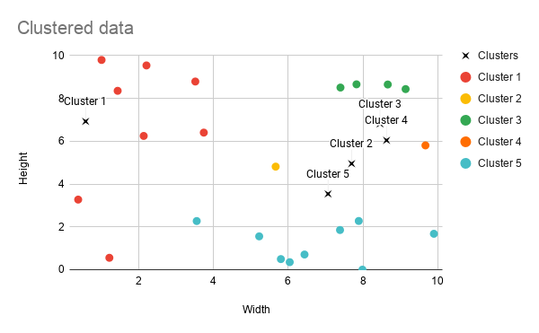
Our clusters
Here’s those clusters visualised on a graph. We can see that Cluster 1 and Cluster 5 are much bigger than the others because the second, third, and fourth centroids we dropped in were all kind of close together. That means that only one point was grouped into clusters 2 and 4 respectively.
We might decide this isn’t a great clustering but it gives us an idea of the groupings and we’re not quite done yet.
So you have your clusters – now what?
So we have our data grouped around central points but as you can see, the groupings aren’t necessarily perfect. If you remember – we didn’t really choose those centroids in any sensible way – we just selected them at random.
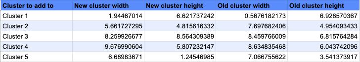
Next, we make those central points a bit more sensible. We look at each group in turn, get the values for all the data points in that group, and average them out. The average we take is the mean – hence the “mean” in “k-means” clustering. The table below is what will happen for Cluster 3.
| Sandwich width | Sandwich height | |
| 7.39876779 | 8.508831577 | |
| 8.666750912 | 8.651484068 | |
| 9.145325869 | 8.437393475 | |
| 7.828862136 | 8.659528437 | |
| Average | 8.259926677 | 8.564309389 |
We end up with an average width of about 8.3cm and average height of around 8.6cm for this group. Those numbers become the values of one of our new central points.
We repeat this for every one of our k groups and end up with K mean value points. I’ve done that for the table below;
Here is how that changes our previous graph;
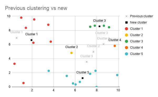
So now we have a new set of points to group our data around. Next we just repeat the previous grouping step – we find the nearest centre for each of our data points (that could have changed because we’ve changed the values of our data points) and categorise everything appropriately.
Repeat until boring
From this point, we continue to group points, recalculate averages, and regroup points until everything stops changing.
If we look at our two graphs together, we can see that our groupings actually haven’t changed after we recalculated the average.
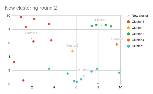
That’s most likely because we’re not working with very many data points so those centroids can move around more without causing anything to switch groups.
Normally in this process the fact that the centroids moved would mean that some of the data points would be grouped differently. That would in turn change the average point of the groups, which means when we recalculate the averages the centroids would move. Which would probably mean some data points get grouped differently, which would change the average, which would move the data points. Eventually the centre points would stop moving in each successive recalculation, or only move by a small amount, and we’d stop there.
Work out how well you did
We can’t assume that our first attempt is going to be perfect – we need to be able to compare our results. K-means clustering measures how good a clustering by calculating something called Inertia.
To calculate Inertia we take the distance from each point to its nearest centre point, square that and then sum it all together.
Basically Inertia is a way to calculate how spread out our clusters are, the less spread out they are the better we consider our clustering to be.
The SK Learn site discusses Inertia as a kind of measurement and there is an exploration of some of the more complex concepts in this Stack Exchange question.
Start again
Now we have a score for how well this attempt went, we save our results. Then we repeat the entire process – choosing a completely new set of random starting points and clustering again.
Usually, we just decide how many times we’re going to attempt the clustering. Once we’ve made that number of attempts we just compare all of our inaccuracy numbers and choose the one that seems most accurate.
That’s it!
You randomly chunk up your data, try to improve the groups to avoid anything wildly off-balance, and hope you happen upon the best groupings.
As you’ve probably realised by now – this doesn’t mean we necessarily end up with the best result. We’re choosing random points to start with, there’s every chance that we just don’t happen upon the best combination. The more times we try, the better a chance we have but it’s definitely not perfect.
As I mentioned above all of that is possible in a Google Sheet (it’s just not necessarily something you’d want to do so manually so feel free to check that out.
Free Python K-means code
As I also mentioned, I’m sharing a free Python Google Colab notebook which takes the same data and K-means clusters it, producing pretty much the same graph at the end.

That notebook should give you an idea of how we can quickly do clustering using the excellent SK Learn library. You should also be able to, quite easily, change the source and use that notebook for your own projects so, by all means, fill your boots.
But how do we compare things that aren’t numbers?
You might be thinking – it’s all well and good grouping sandwich sizes, but people are claiming to use things like this to group people, right?
Yep – they are and that really just comes down to turning things which aren’t numbers, into numbers. If we’re trying to work out if someone wants to buy Lego rather than saucepans, we might look at age as a number, but we might also convert whether someone has kids into a 1/0 score based on the assumption that people with kids are more likely to buy. We might turn interest in Harry Potter, for example, into a score by seeing how often people have viewed Harry Potter pages. We might assume that someone who has viewed a lot of Harry Potter pages would be interested in Harry Potter lego.
Because all of these groupings are based on how “close” data points are together, some decisions go into how much something should be weighted. Should the kids/no kids score be 1/0? Or should it be 999/0 under the assumption that having kids could make a person much more likely to buy Lego?
To cover off our other example – grouping search terms into categories using the pages which are ranking for them – we can take a similar approach as we did with our kids/no kids score above. We can start by getting a list of all of the top 20 ranking pages which appear for every keyword in our list. Then, every single page becomes a possible dimension for one of our data points – perhaps the value is 1 if it appears, 0 if it doesn’t. We wouldn’t be able to visualise it on a graph any more but we then go through exactly the same process – grouping things based on how close they are together.
The benefit of this is it can lead to similar results as the kind of decisions we might make – even if the lists of pages ranking for two keywords aren’t exactly the same, if a lot of the pages are the same we’d probably come to the conclusion that the keywords are highly related and we can probably target them with the same page.
Particularly when we’re using things like demographic data, this can all get pretty shady. Unless we use it carefully, processes like K-means clustering can just mean we make the decisions we were going to make anyway, but at a bigger scale and with far more undeserved confidence in our own impartiality.