Good Place Word Clouds
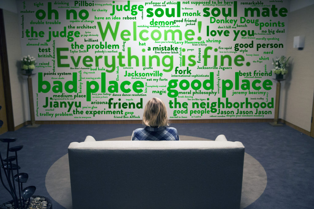
I am a huge fan of the Good Place so I created these Good Place word clouds specific to each of the core “team cockroach”. Zoom in to find phrases or words you recognise from the show. I’ll follow up with more detail about how these were created but I used scripts from the show, […]
Good Place Word Clouds Read More »